Home renovation is no joke! But don’t let the magic of a home makeover get lost by the fear of time lost and money spent. With just a little careful planning the results far outweigh the costs and ARE worth the effort….both in how you feel…and how it improves the value of your home. 

Understanding a few of the basic elements of interior design will help you zero in on what is most important and have you transforming the ordinary into a dream space in no time!

The Basics

Get started by learning these five basic design concepts. Understanding these will help ensure you get a balanced, well-rounded classy look.

The five basics of interior design are: line, space, texture, shape and form, and color.

Kunst Bilder/Shutterstock.com

1. Line refers to how the layout pulls the eye around a room. What do you see first, then next, etc. Are the eyes drawn vertically or horizontally?

2. Space is about understanding how to work with the architectural details in the room, like how to incorporate a railing or bay window.

3. Texture includes the feel of the elements in the room. A matte wallpaper, jute basket, metal frame, or glass table all contribute to the texture of the room.

4. Shape and form have to do with the kinds of pieces (furniture, art, plants, etc.) in the room. Organic shapes are more round, flowing, and irregular. Geometric shapes use more straight lines and create a sense of order in the space.

5. Color is perhaps the easiest for the non-professional designer. From wall paint to flooring, couch cushions to gallery walls, anyone can choose a color palette that they love and use it throughout the space!

Now that you’ve got those down, let’s see how you can use them to get focused on a renovation and spend your time and money most efficiently. Let’s dive into some popular design styles and see how we can apply these basics in a real space!

Industrial Kitchen

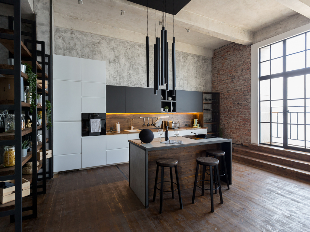
Contrasting textures set an industrial space apart. Wood and metal combine to create movement while keeping sharp lines. In a kitchen this could look like a metal or concrete countertop, metal and wood exposed shelving, and statement metal or glass pendant lighting.

PinkyWinky/Shutterstock.com

Colors are usually kept neutral, again using a mix of a light base with dark accents to create dimension and interest. 

Keep the space uncluttered to help the room seem as large and spacious as possible, favoring geometric or angular forms.

Mid-century Modern Bedroom

Mid-century modern has taken millennial homes by storm.

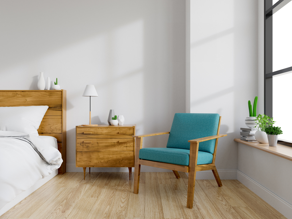
Balance is the most important characteristic in the mid-century modern style. This design blends soft organic and hard geometric shapes using furniture and materials with an uncluttered and minimalist aesthetic. The introduction of plants next to furniture with simple, clean lines furthers the sense of a perfectly orchestrated space.

LEKSTOCK 3D/Shutterstock.com

In Mid-Century Modern design, colors play off each other by balancing a neutral base with pops of jewel toned furniture or art. 

The room is often broken up by a ⅓ vs ⅔ line, with low furniture leaving plenty of wall space. Simple lighting will help maintain the flow of the room without distracting the eye.

Boho Living Room

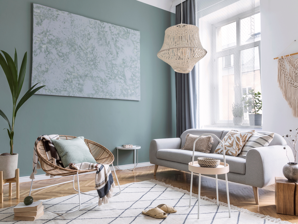
Hello 60s and 70s free spirit! Texture is essential to the boho style. There is plenty of room to play with upholstery like a velvet couch or chair. Rugs and tapestries are also right at home in the boho style. You can even play with lighting with a wicker or beaded chandelier to add another element of texture. Accessorize your space to your heart’s content!

Followtheflow/Shutterstock.com

While most other design styles use a neutral base, Boho styles encourage floor to ceiling use of blues, pinks, greens or other bright colors as the base. If that doesn’t feel comfortable, don’t worry! Minimalist boho style has also emerged as an option for those that love the color and freedom of this style, but want to combine it with a neutral color scheme and a less cluttered feel.

Transitional Office

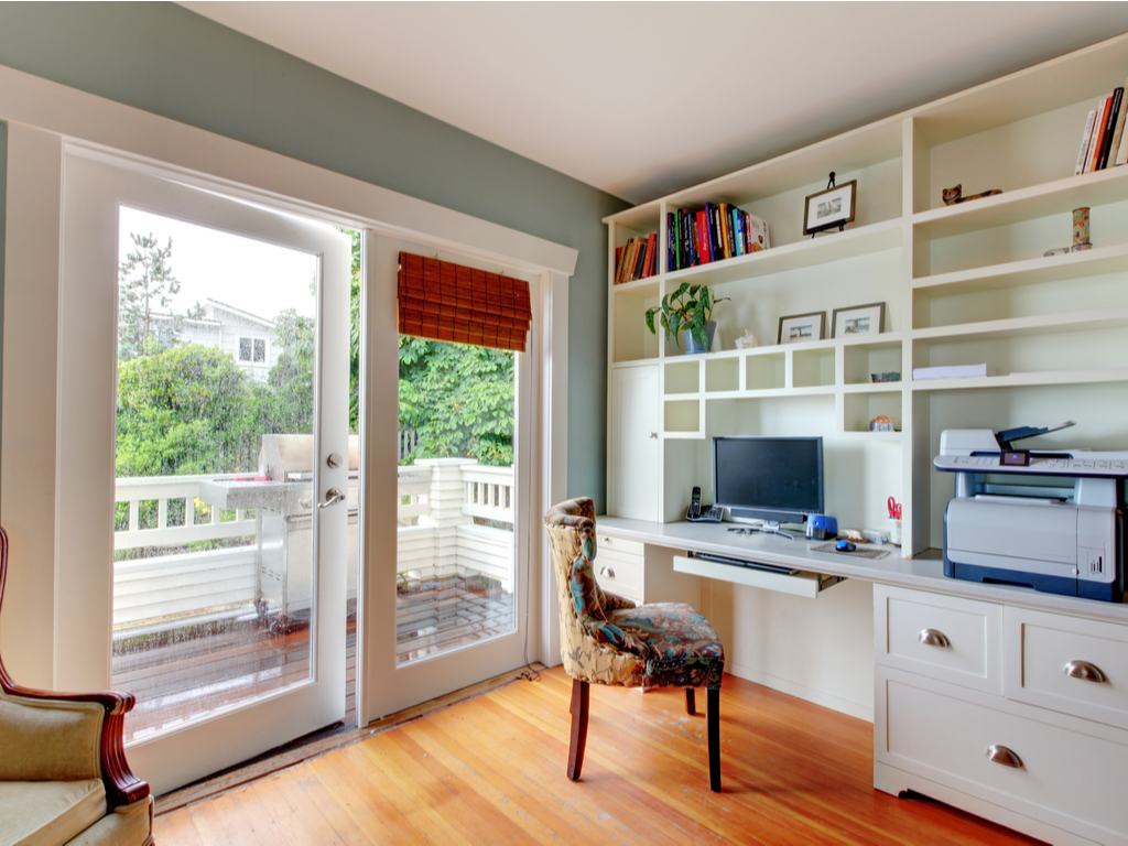
Transitional style blends traditional and contemporary styles into a happy mix of the past and present. This style usually favors a more neutral color scheme, but adding in some restored vintage furniture can be a fun and exciting way to add some texture and a pop of color. Mix it up with modern touches like a contemporary chandelier to ensure the room doesn’t get stuffy!

Artazum/Shutterstock.com

Clean and straight lines are hallmarks of the transitional style. When choosing accessories like art or rugs, go for more angular pieces.

Rustic Dining Room

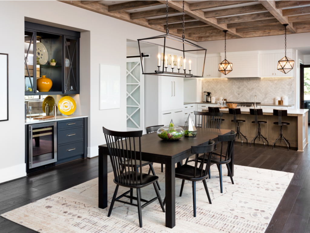
Whether you love farmhouse or cottage core, or you just longing for a more cozy and woodsy feel, a rustic dining space will deliver on those natural and comfy vibes.

Breadmaker/Shutterstock.com

Color and texture are great places to focus. Keep the overall scheme light, bright, and neutral. Pops of color in patterns like florals and plaids are definitely welcome!

Bring nature in by incorporating lots of warm, wooden textures. To keep the space from becoming one note, layer other natural textures in the room like stone and iron. Incorporate these harder materials in flooring and furniture, or go bold with a rustic chandelier hanging from a wood beam ceiling. Comfort is very important in a rustic room, so add in some soft textures to get that cozy feel with upholstered seating, a woven rug, curtains, or a table runner!

Help is here!

Renovating a home doesn’t have to be overwhelming. Remember to focus on an overall theme, and apply these basics to create your game plan. No matter the size of the project, updating old light fixtures is an easy way to instantly change the whole feel of a room. 

Still not sure where to start? Let us help! Our lighting design experts are ready and waiting to help with any of your lighting questions and needs.